Name of Artist: Jan Groover
Dates of Artist’s Life: Born: April 24, 1943. Died: January 1, 2012
Personal Background:
Jan Groover was born on April 24, 1943, in Plainfield, New Jersey. She studied painting at the Pratt Institute in New York City, New York, from 1961 to 1965. She started taking photos in 1967 and has been a freelance photographer there since 1971. She was an instructor at the University of Hartford in Connecticut from 1970 to 1973. She gave up painting and turned to photography, full time, in 1972. She began focusing on still life photography in 1978. She began teaching at the State University of New York at Purchase in 1979. In 1991, she moved to France with her boyfriend, and died in January 1, 2012, in Montpon-Ménestérol, France.
Style:
Jan Groover, to quote John Szarkowski, was a “late-20th-century heir to Edward Weston.” Her photos are sometimes very colorful and vibrant, while other times black and white. She usually took photos of still lives. She often focused on kitchen supplies, like spoons and forks, or food, like pears. Also, some of her work showed odd combinations of objects in a very bland location.To be more specific, she has very vibrant and shown shadows in most of her work.
Philosophy:
“Formalism is everything,” was Jan Groover’s motto. She transformed everyday items into beautiful, formal still lifes. “I had some wild concept that you could change space — which you can,” is a famous quote of Groovers. “According to Groover, the meaning of the objects is of no importance; only the shape, texture, and form that falls into a particular space is important,” said the Holden Luntz Gallery. When she switched her focus from painting to photography, she commented, “With photography I didn’t have to make things up, everything was already there."
Influences:
Jan Groover has influenced me more than I would expect. I used to take broad pictures of a whole scene, not caring about the details. But, her close ups of different objects inspired me to do the same in my photos. I started getting closer, looking for intricate details. Her beautiful photos of ordinary utensils showed me that beauty is everywhere, if only I would look closer.
|
Jan Groover's:
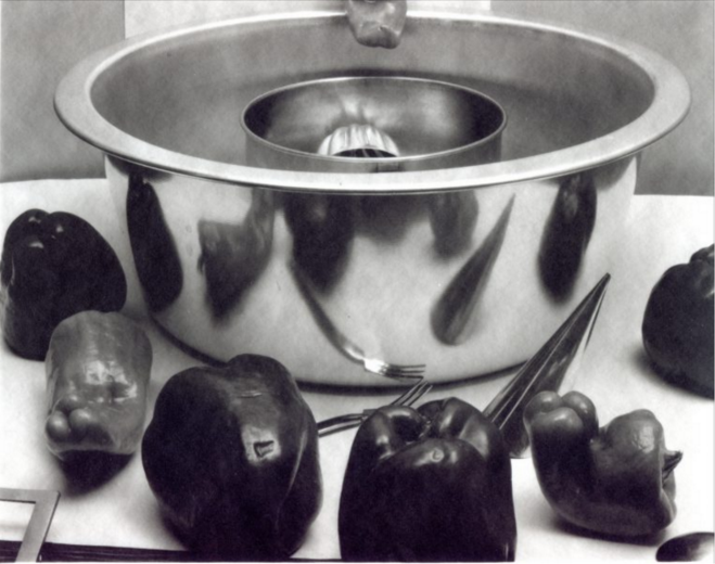
Untitled
"Jan Groover." Janet Borden Inc. N.p., n.d. Web. 27 Feb. 2017. <http://janetbordeninc.com/artist/jan-groover/> |
Mine:
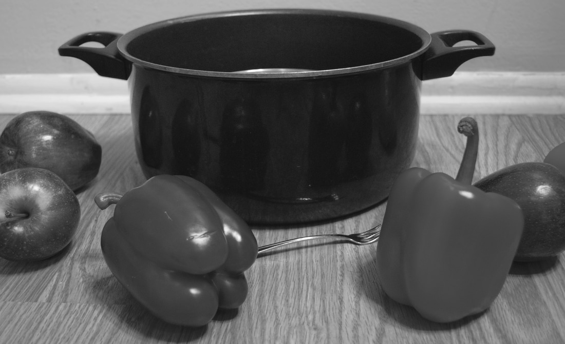
Normality
|
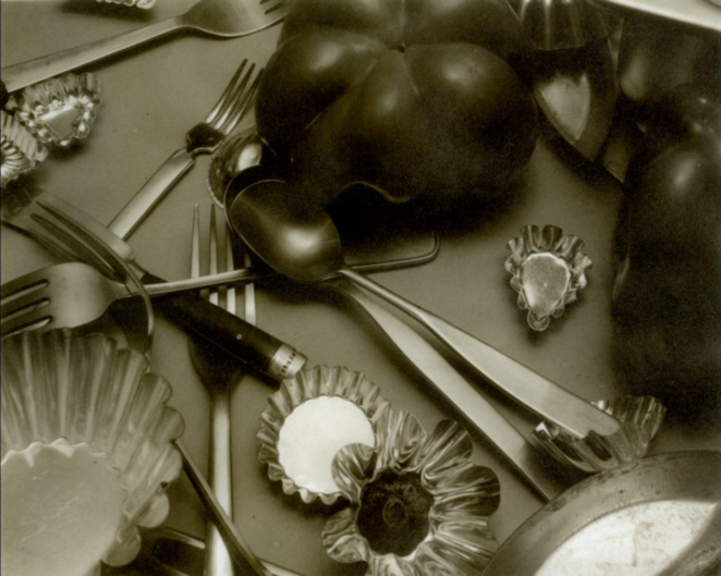
Untitled
"Jan Groover." Janet Borden Inc. N.p., n.d. Web. 27 Feb. 2017. <http://janetbordeninc.com/artist/jan-groover/> |
Life
|
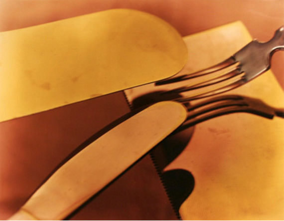
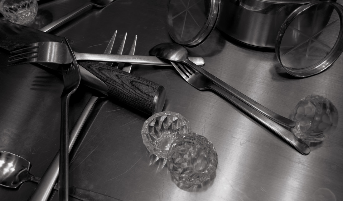
Untitled
Barnas, Ed. "Jan Groover Selected Works." New York Photo Review. N.p., n.d. Web. 27 Feb. 2017. <http://www.nyphotoreview.com/NYPR_REVS/NYPR_REV2047.html> |
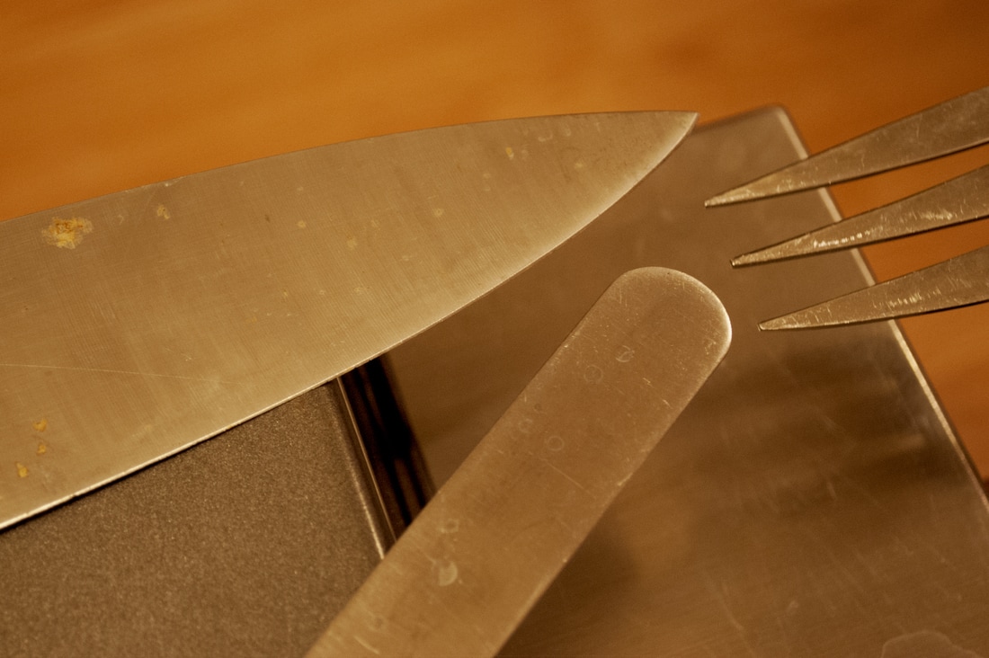
Blades
|
Compare and Contrast:
In many ways, my images are both similar and different to Jan’s.
Normality, I believe, is the more different than similar. First of all, the food in front of the pot in my photo is more spread out around the area. Jan’s food is focused more into the pot, and not about the space inbetween. My photo’s pot is darker, and the food is lighter, while Jan’s pot is lighter, and her food is darker. Her background is more smooth and reflective, while mine is more textured and bland. My objects are smooth while hers are rough and textured. We both have the same general objects, but they’re in different places to each other. Lastly, I took my still life at a different angle from her’s.
Life, is quite similar to Jan’s picture. They both have roughly the same objects in mostly similar areas. Some of her objects, I used others that looked similar to them, or had the same effect. For example, the glass cups in mine. The feel of the photos are quite different though. Her photo feels more homey and clustered with the amount of objects and the brown tint. Mine feels more cool and less clustered, more structured mayhem because of the less objects, the glare, and the darkish blue tint.
Blades, I feel, is the most similar to Jan’s out of all three. Still, there are some differences between the two. The objects are about the same shape and size, and the background is similar in texture and look. Jan’s photo is more blurry than mine. Why, I do not know. I had more focus on the fork to the right, while her focus was to the left. Her shadows are more apparent than mine. Overall, the two photos are quite similar.
Personal Artist Statement:
My images show the story of a normal kitchen in an average, everyday life. Normality has the cooking and creation aspect, Life has the mess and work, and Blades has the exhaustion, yet beauty. They all use the Rule of Thirds to make the focus apparent. Texture was more used in Life and Blades, and not Normality. I used balance specifically in Life, asymmetrical, and Normality, symmetrical. Rhythm was used in Normality the most with the food around the pot. All three photos used many rules in Composition 101, Elements and Principals, and the 10 Rules of Photography.
My images show the story of a normal kitchen in an average, everyday life. Normality has the cooking and creation aspect, Life has the mess and work, and Blades has the exhaustion, yet beauty. They all use the Rule of Thirds to make the focus apparent. Texture was more used in Life and Blades, and not Normality. I used balance specifically in Life, asymmetrical, and Normality, symmetrical. Rhythm was used in Normality the most with the food around the pot. All three photos used many rules in Composition 101, Elements and Principals, and the 10 Rules of Photography.
